We reduced support tickets by over 52% by prioritizing user needs
Jump to resultsThe Challenge
Having a CMS that caters to the banking industry has proven to be successful for our company, however our technology stack was starting to show its age.
Outdated CMS

The Adobe Flash™ based admin tool above highlights the tech debt accrued over the years. Getting off Flash meant understanding the nuance of the various dependencies in the old system. While the company had tried an off-the-shelf solution to replace it, its compexity proved to be too daunting for the average user, causing numerous frustrations including additional training, maintenance, and support.
“Using the CMS has been a bear. It’s not user friendly or intuitive and even with some tutorials and walkthroughs, it misses the mark”
- Client Bank
The Not-so-ideal Solution
As you can see from the video (sped up 8X) the replacement CMS was overwhelming, offereing up
way too many choices for something as simple as updating an image on the main page.
We realized that the only way we were to get this right was to go with migrate off this system to a
newer, home-grown system that was showing good results since its hackathon debut.
Hackathon to Production
Listening, Reflecting, & Identifying
Users seemed to respond well to the simple UI of the new offering, but it was still lacking in features and extensibility with other systems.
We had to understand the entire process from design handoff to development through delivery and follow-up. This is where we engaged internal and external teams to uncover additional frustrations and ineffieciencies. I addressed heirarchy, information architecture, and project priorities through collaborative workshops. I also employed various strategies to collect and analyze the data I had at my disposal. See examples of the types of data collected >>

Information Architecture
Mapping the experience highlighted the issues uncovered through qualitative data gathering and gave the team perspective on the disconnect between the users’ experience and how the system was built. The most obvious was that users must contend with up to three different applications for site management. This was confusing, frustrating, and required too much context switching.
The new, streamlined approach I offered up had potential but ran into tech debt challenges. The cost of changing to the “happy path” for users would have to come incrementally.
Getting the system out of Flash became an internal priority. Since the front end was already built on a popular HTML/CSS framwork, we only had to worry about the legacy dependencies as we moved forward with our suggested improvements.
Prototyping
Building, Testing, & Learning
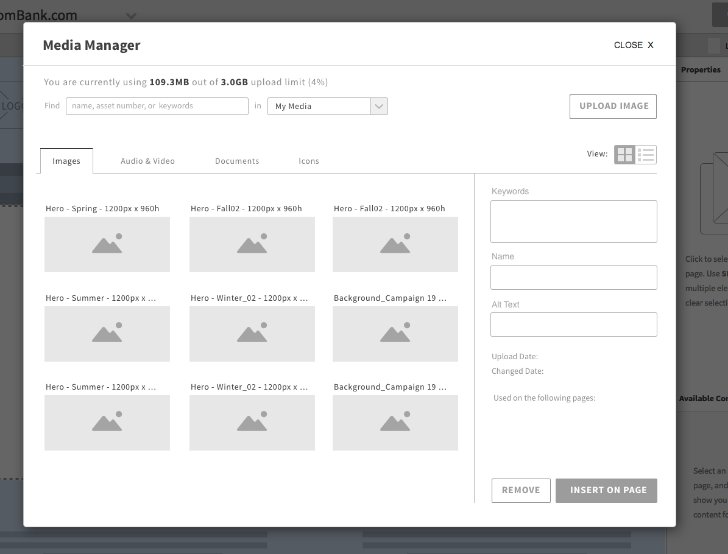
The original concept for the new CMS was developed during a hackathon. While it was an improvement over the old CMS, there were still outstanding issues that needed to be addressed including better editing capabilities and asset management.
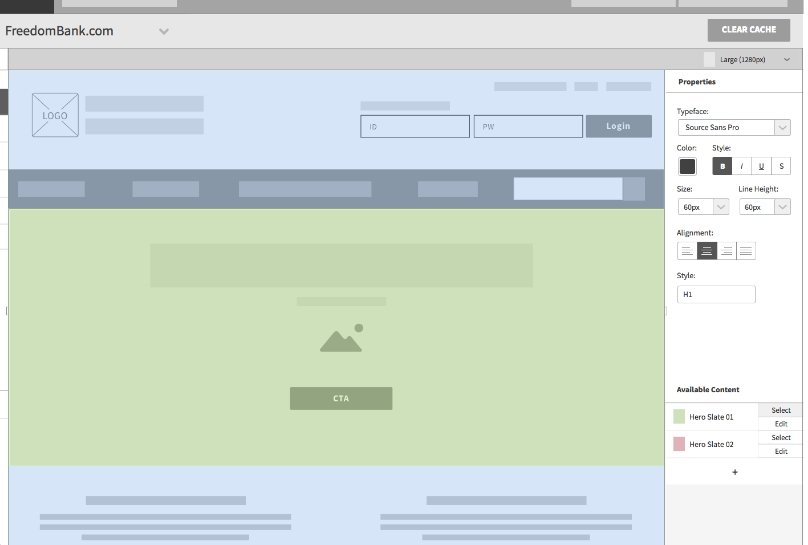
After collecting and processing user feedback, I spun up an Axure prototype the team used to show as a possible future state for where the CMS could go. Features included in-line editing of text customizations, a context aware slide-in panel for editing, and interactive affordances that allowed users to hover over an element within the CMS to identify if it was editable. These were regarded as table stakes based on a competitive analytis I lead and conducted.


Further Client Feedback
Feedback was distilled into “Positives,” “Negatives,” and “Recommendations” based on what we heard. This was crucial in poviding the necissary undestanding around dev, business, and UX requirements.
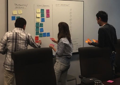
We whiteboarded our findings for all to see and conducted show-and-tell sessions which afforded us speed and accessibility with key stakeholders as they could just walk up and comment easily.
Key Takeaways:
- Clients had different priorities than the business. For example, Blog support (a business feature slated for an upcoming release) was nowhere near the top of their list so far as importance.
- Scheduling content was a major pain point for all participants.
- Live view, the area in which clients saw their changes immediately publish (and a perceived benefit) made clients anxious because they couldn’t preview their work before it went live.
Developer Environment
I didn’t want to neglect our seconary stakeholders, which are our developers and support staff. We needed to understand their day-to-day as well, therefore I conduced some job shadowing and found out that
many of our developers have multiple windows with each app opened in a seaparate tab. They’re able to jump from the browser, to the code editor, to Photoshop easily. This is a-typical for FIs who are often editing on a older desktop.

Functional Build
We worked through some of the main features including image banners, scheduling, and others that were slated for release. We coordinated with the development teams to ensure things were accurate to the design spec.
Because we were able to get with clients early and often to test our hypotheses, by the time the features made it to the app they were well vetted and met clients' expectations.
“I do appreaciate how much easier it is to navigate. [it’s much more user-friendly and pretty intuitive…I do like the ease of being able to log in and make a quick instant edit”
– Bank Client
“Since rolling out the new KCMS – we have been able to make some changes ourselves and hope to eventually make ALL changes ourselves. We’re extremely happy with…[K]CMS…We love it!”
– Bank Client
“I love, love Love the new CMS! It is very quick and easy to use!”
– Credit Union Client
Results
Better experiences begin with users at the center. Introducing a regular cadence with clients allowed us to improve the software through direct evidence.
By providing UX a seat at the table, we were able to turn a process that had been more Dev and PM focused into one that brought insignt and clarity around what users really want & need. We adjusted our roadmap when it was detirmined that our users didn’t care as much about certain features and prioritized things that mattered to them. And while this is an ongoing process, we’ve established a foundation for further growth by ensuring the triad of Dev, PM, and UX where working in concert.
Ultimately, we were able to:
- Better differentiate ourselves in the market by providing industry specific solutions
- Uncover new business opportunities by capturing additional client needs through testing
- Engage clients early and often, making them feel more connencted / invested
- Bolster our consultation arm by understadning their workflow & streamline processes
- Scale our platform across financial institutions by addressing the big challenges first
- Modernize our offering to reflect user expectations
54% Fewer Tickets
Client support tickets decreased due to recent design enhancements measured over a 9-month period.
 After:
With the current trajecory, we’re on track to cut that in half based on early feedback from clients & support.
Client Satisfaction
As a result of our improvements, client satisfaction scores for consultants increased across the board. On a scale of 1-5, we were now averaging in the high 4s. We knew that by continuing to evolve and build on our successes we could grow that number even more.


